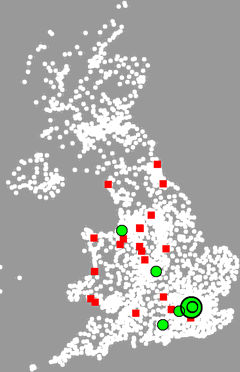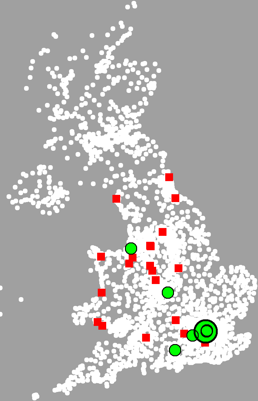
Old talks in red
Future talks in green
Larger means sooner
Speaking Engagements Map |
|
|
 Old talks in red Future talks in green Larger means sooner |
The map shows a white dot for each postal district, a red dot for some past talks, and a green dot in a black circle for some of the upcoming talks.
The problem is, I feel that the map should be clickable in some way, but I don't know what a click would do. Should it give more information about the talk? Should it perhaps give the date, time and location? The problem is, there are many talks in small areas, so it would be hard to be sure you got the talk you intended, and it would be hard to get talks that are "hidden behind" others. Further, there isn't always that much more to say. Exact date and time is about it, really.
So I'd really be interested to hear your thoughts. I'd like to know how you think a clickable map like this could work. The technical side isn't that hard - the difficult bit is knowing what the user interface should be.
See also:

ContentsThere were no headingsin the main text so there is no table of contents. |
Links on this page |
|
 Suggest a change ( <--
What does this mean?) /
Send me email
Suggest a change ( <--
What does this mean?) /
Send me email|
|
Quotation from Tim Berners-Lee |
|